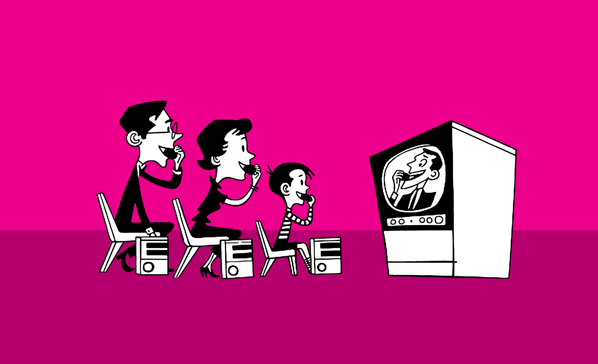
If you want to engage, you’ll love this brilliant idea for video

family engaged with video

When I was a young boy I always wanted to make films. It was just serendipity that I ended up at art school studying both graphic design and film and eventually chose graphic design. Back in those days, anything film based at art school was called ‘Time Based Media’ because, well, I suppose, it used time as a medium just as we would use a magic marker, a Rotring pen or a scalpel.

Corporate video to viral sensation

Since then, as we all know, ‘time based’ media has become an essential part of online digital storytelling. Over the last twenty years it has progressed from ‘corporate videos’ (essentially a four minute brochure with a limited audience viewing it on a TV via cassette, or played on a loop in a foyer) to an anything-goes, disposable culture where videos of all and every lengths are uploaded, shared, ‘go viral’, trend and then ultimately crash from relevance – but never from history – everywhere, all the time. Probably forever, now.

At the last count, three hundred hours of video is uploaded every hour to YouTube alone – and nearly five billion people watch them every day. Five BILLION viewers. EVERY. DAY.

A world of experts?

Just as it happened with photography, YOU are now a professional. There are intuitive apps which overlay digital effects straight from the brain of JJ Abrams on to your story, immediately and for free. You don’t need me to tell you that time-based media has exploded (there’s an app for that too) and it’s brilliant. Digestible, fun – and best of all – the prize, the big kahuna, the panacea for your social media… ENGAGING.

It seems like everyone nowadays is a celebrity or professional photographer, blogger, special effects artist, film director or a Love Island contestant. But I think it’s important to remember that all the tools we use are nothing without some really bold and brilliant ideas to elevate your content from a major turkey in a sea of white noise (I’m talking to you, Twitter, you angry bird) to a blockbuster with five million likes on Instagram.

Brilliant conversion!

So while video can increase conversion by up to 80% on your landing page (according to HubSpot), it’s not the medium that engages, it’s the brilliant idea behind the medium – and brilliant ideas don’t need time. And the best brilliant ideas are timeless.

So which one are you? A professional photographer, a prize-winning film maker, a Love Island celebrity or the quiet one in the corner coming up with the brilliant ideas… and who really drives engagement?
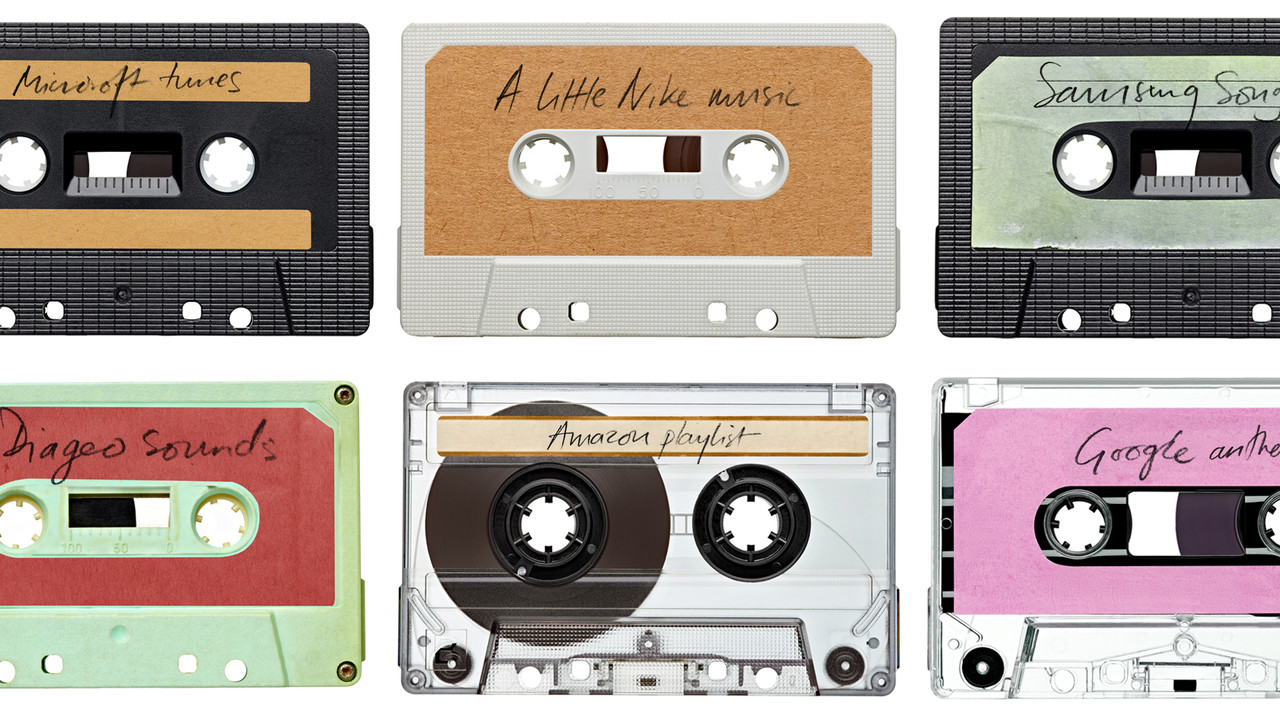
See me, hear me, brand me.

see me, hear me, brand me

He was talking passionately about lost Prince songs, the Edwin Hawkins Singer’s version of ‘Oh Happy Day’ and how ‘Ball of Confusion’ by The Temptations so effectively captured that essence at the heart of his film. The lyrics, the energy, the FEELING that music can add to the sense of a ‘thing’. And the interviewer speculated that Quentin Tarantino would ‘probably be ‘biting his fist’ when he heard it.

And who knew combining B-movie kung-fu, 60s Western soundtracks, cult surf songs and classic soul would give birth to a new type of postmodern cinema cool? Quentin Tarantino sustains his ‘brand’ through a variety of genres – from Westerns to WW2 to heist thrillers – in a number of ways but especially through the music he curates for his films. No matter the period, genre or narrative, his music choices ensure he is always on-brand Tarantino.

Of course, using music to inject substance in to film is nothing new – but it wasn’t until 1985 when BBH and Marvin Gaye’s ‘I Heard it through The Grapevine’ helped increase sales of Levi 501s by 800% in advertising. At the height of 80s capitalism and shiny new stuff, the 60s were cool again, and so were Levi’s. TV advertising never looked back, if you’ll excuse the pun.

As designers and marketeers, it doesn’t always occur to us to think in terms of sound when we are problem solving, but as brands have become increasingly more about telling stories through digital and time-based media, the importance of music should not be underestimated. Maybe it’s time for us to not just think about how a brand should look and feel – but also how it should sound.

Dunk Design are obsessed with music and have a load of playlists ready to get in to your ears, and they are all on Spotify. The latest is available now

Collaboration in an unexpected place…

Pinterest boards

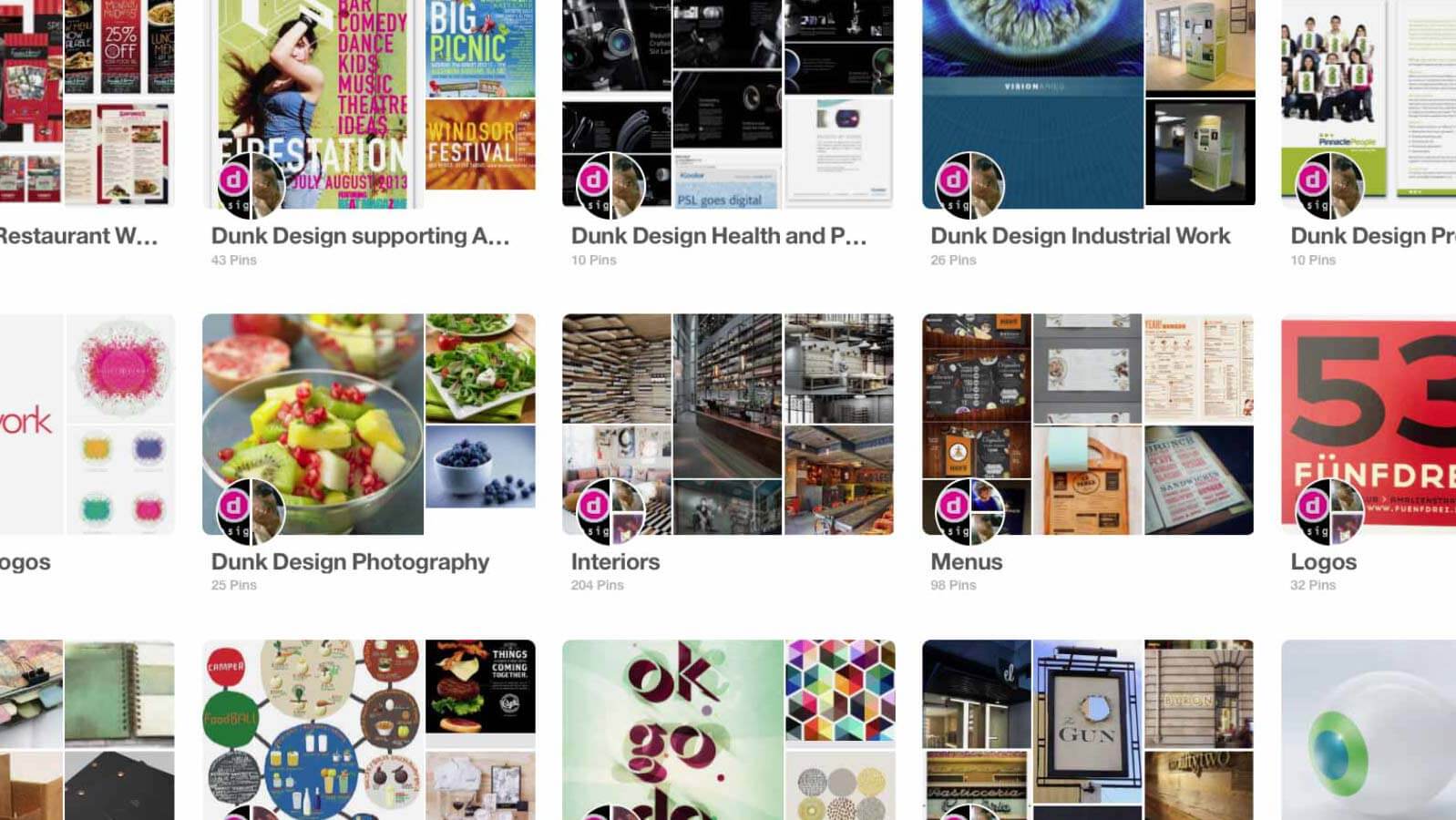
There are many ways to share images with clients, but time and time again, we come back to Pinterest. It serves as a rough and ready ‘mood board’ – with all parties able to view / add / comment at any time (as long as we can share and they can log-in – but that’s a whole other post). Projects can evolve quickly – an initial idea can be taken off in a new direction whilst on the phone to the client, and the themes can evolve right in front of everyone’s eyes.

Whilst we love a mood board, sometimes you need a more fluid, fast and flexible approach and, for us, Pinterest offers this.

Our project boards are kept private but we have a wealth of public themed boards to offer inspiration, and show examples of our work. Check us out at https://uk.pinterest.com/dunkdesign/ and let us know what you think.

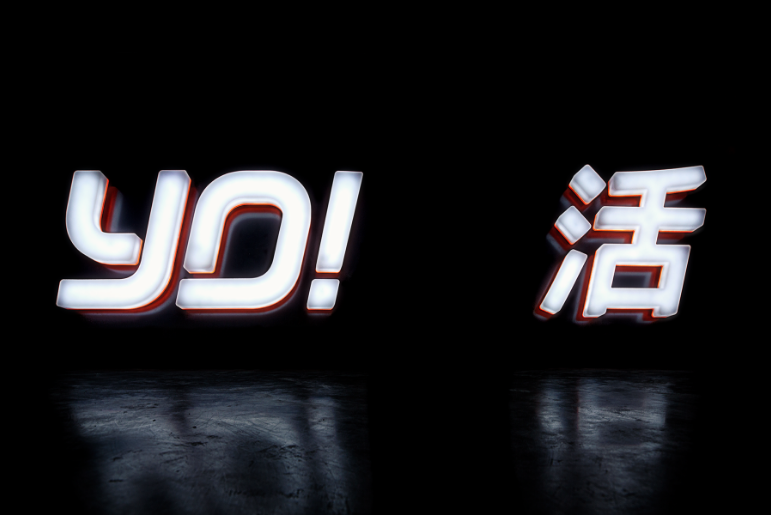
Yo, are you changing, or just teasing?

Yo Sushi logo

And this time I reckon they’ve got it just…about…right (bar the thick black keylines, it’s more mature, cleaner and stripped back)

But why have they embarked on another re-brand (with a different agency) in the space of 6 months? For a brand built on successful idiosyncrasy, this seems like a weird move. Not only does this probably duplicate major investment, it hasn’t been rolled out anywhere other than online.

And as they’re saying the brand look is still ‘evolving’, their new 200 page ‘brand book’ looks like an expensive vanity piece. Is this unusual approach fresh, or is there something fishy going on?

Making branding changes in a 2D environment is easier than making them work in 3D but they’ve still got to work in the end. So is this delay in moving to merchandising part of the managed brand transition? Are they using the slow, and somewhat confusing transition, as brand communication in itself?

An idiosyncratic brand transition for a great, idiosyncratic brand. Time will tell…and I’m curious about what happens next, yo.

Apple: Time to get virtually real?

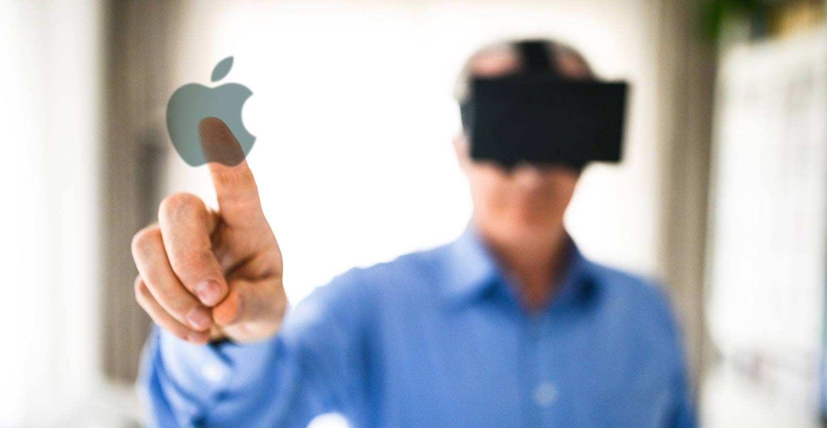
Virtual reality and Apple

And I’m starting to see more and more people becoming increasingly frustrated by the constant tinkering and over-complication of iTunes, uninspired iOS updates and sustained pressure to move us all to the iCloud. And, come on. Do we REALLY need five different types of iPad? 

We don’t necessarily want Apple to amaze us with a game-changing device every Autumn; they are, after all, masters of refining existing tech. We just want them to get us to look at our lives in a different way. You know, like they used to.

I know I’m not alone in thinking that Apple has lost its way since the death of Steve Jobs but I still want to believe that they can deliver something as revolutionary as the first generation iMac, the iPod and the iPhone.

Back in February someone strapped a Samsung Gear virtual reality headset on to my head and I was suddenly leashed to a wheelchair being pushed around a seriously haunted lunatic asylum. In another app I was the actual bullet being shot from a gun. The experience was immersive and thrilling and opened up my eyes; I felt I had just glimpsed the future – and the last time I felt that was when I pinched and scrolled a website on an iPhone for the first time.

I searched for an Apple equivalent to this experience and there was nothing close to what Samsung are doing – the available headsets and VR apps I found felt years behind. It may be no secret that Apple have registered patents and are working on VR tech but can they surpass the experience that Samsung Gear currently offers and accelerate our inevitable adoption of this life-changing technology? To me, it seems the natural path. But with Nintendo now using Pokémon Go to engage a massive audience with AR, by the time they announce AppleVR it may already be too late. 

I’m keeping my fingers crossed that they will be surprising us soon. If not it might be the beginning of game over.

Trust me, I’m a designer.

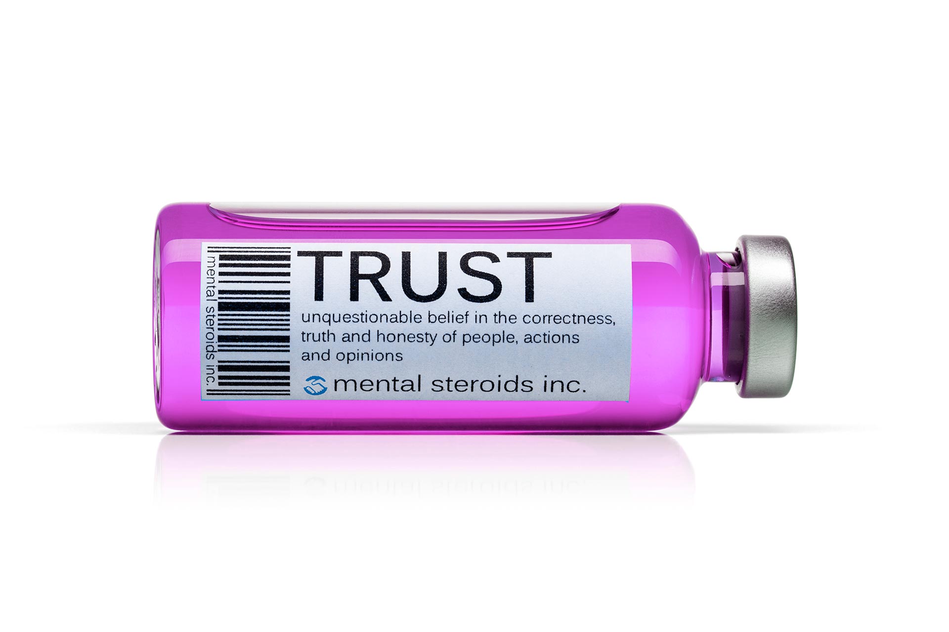
Trust label on a medicine bottle

No one really knows who to trust or what is going to happen, do they? All we DO know is that by the time we find out it will be too late to go back. And anyone remotely interested in the debate will be thinking about what the ‘right’ thing to do is – and what the concept of ‘risk’ means to them.

As a designer, risk is embedded at the heart of everything we do – and we should be totally committed to our belief that the decisions we make, guided by an informed briefing process, will be absolutely the right thing to do on behalf of our clients. Otherwise we wouldn’t be doing our jobs properly, right?  

Designers look at the world through different eyes. We absorb and process trends, ideas, messages and information every day so that we can generate innovative, engaging communication in a world which is becoming increasingly message-heavy and challenging.

We instinctively know what is working and why. Maybe it’s our OCD but whether adjusting a font size up by 0.5pt or nudging an image 1mm to the left, we are 100 per cent confident that it looks – and feels – just right. And by the time we deliver a solution to our clients risk is no longer a factor; it’s been processed right out of the equation.

So be challenged by your creative agencies and allow them to show you something new. We’re always thinking ahead and the right creative partner should take you on a journey that pushes the boundaries of their thinking and communication – and, best of all, yours too.

Design: only 50% of the job.

Design and Distribution

For the best part of 25 years I’ve worked on design-for-print projects from the bizarre to the borderline impossible and, for the most part, have enjoyed every second of the process of applying creativity to commerce. 

But there’s a part of the process which designers rarely talk about with their clients: print and distribution. Without these we are redundant. The most effective design in the world is of no use if your print standards aren’t high enough and in the hands of your customer at the right time. And in the hospitality sector where I’ve cut my cloth this is always going to be 100% essential. And that’s where everyone needs an efficient and experienced print and distribution maestro.

Allow me to share some stats with you; 

  • About 3 times a year we undertake print and distribution for 1 client approximately 350,000 litho and digitally printed items broken down into 24 different menus and pieces of point-of-sale.
  • Over 3 days these are then bespokely picked, collated, packed and delivered to restaurants from Aberdeen to Plymouth, Belfast to Eastbourne and over 250 destinations in between. 
  • On time, in full. 100% success.
  • And, at last count, with over 2.6 million print impressions for a single client last year, we like to think we’ve got some great design working hard to deliver improved results for some of our favourite clients.

So, in the spirit of International Women’s Day this week, I salute and thank the most efficient and conscientious print and delivery system I have ever known.

Ladies, and gentlemen, please be upstanding and raise a glass of sherry to MY print and distribution maestro: Leigh Hammans. (Not that she gets much of a chance to drink but when she does it’s usually a sherry).

Cheers Leigh!

Inspiration – the real force.

Boy dressed up as Darth Vader

…Yes, I’m jumping on the cantina bandwagon.

Important dates and deadlines are looming large at this time of year but this week there has been one date that has usurped them all. Yes, alongside millions of fans, nerds, obsessives and compulsives, I’ve been counting the days to the new Star Wars film (we call it just ‘Star Wars’, OK?).

As I recall, from the pre-1977 Star Wars days, the country was in black and white and it was a mess. Three-day weeks, the IRA bombing the mainland, strikes everywhere, rubbish piling up in the streets and really, really crap and dangerous toys.

Then at ‘the pictures’ (as we used to call it under a Labour government), Star Wars completely blasted my tiny little mind into technicolour. It blew my beige world apart then rebuilt it with fantastic little sci-fi bits that I did not understand but somehow made absolute sense.

I had experienced absolute creativity for the first time in my life. Someone out there had constructed a perfectly formed new world so packed full of discovery, ideas and excitement. And I wanted IN.

Designing, drawing and constructing countless spaceships out of paper, painstakingly copying posters with felt-tips and storyboarding my own scripts with pens and Plasticine models.

I immersed myself in this world the only way I knew how. Design.

And thirty eight years later I’m immersing myself back into the world which brought me to where I am today, only this time I guess I’m designing more than Y-wings and TIE-fighters.

So while seeing my old friends again is inspirational, it’s perhaps appropriate to thank George Lucas. Thank you for the original Star Wars films and the direction you gave me, and the countless other fans you inspired to pursue creative careers.

But let’s not mention midichlorians and the Jar Jar Incident for now, eh George?

3 steps to simple branding … never easy.

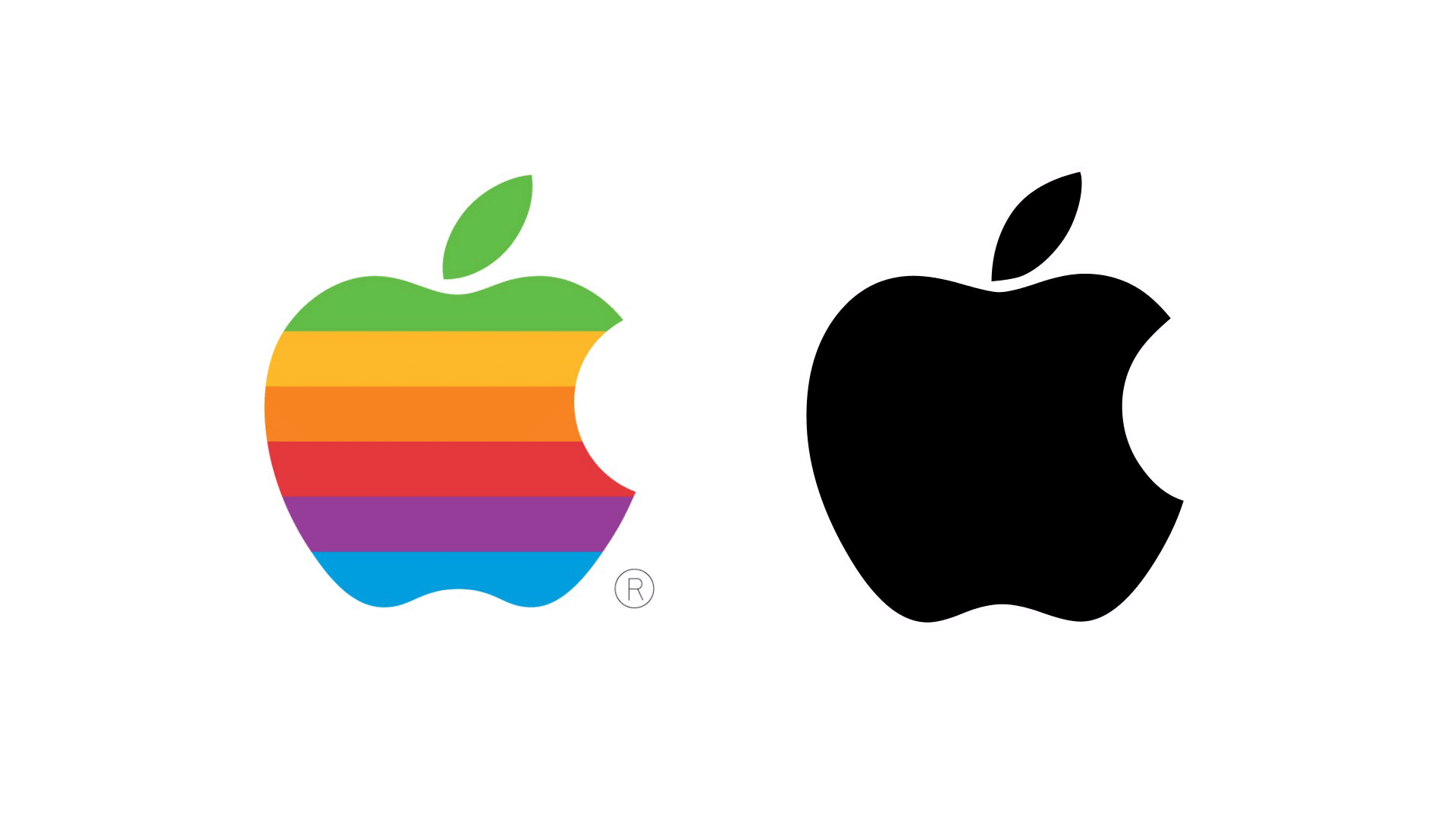
Old and new Apple logos

Triggered by the new Steve Jobs film, the context was a discussion around brands that have very simple yet powerful logos like Apple, Nike and Twitter. All these identities enjoy a position where their brand recall is so powerful that their name is no longer required in their logo. Genius.

For me, less is always more and simple is always best. Yet it’s never THAT simple.

The evolution, design and effort required to reach a point where the name isn’t required is often underestimated. So as we see more and more start-ups, entrepreneurs and evolving businesses throwing new communications our way, how hard is it to ensure a logo will evolve to a point where it perfectly embodies a brand AND has mass recall?

The marketeers I speak to understand that this is something that takes work. However, they must also have a long-term vision when beginning the logo development journey.

When you’re briefing a logo, the three key ingredients you must always look for in the delivery are:

  1. Aesthetic: it has to look good – and it has to be unique!
  2. Relevance: to your product or brand, and
  3. Simplicity: the graphic has to work efficiently and be versatile.

I’d like to think that Nike’s overall message was movement and positivity. The tick leaves you with that feeling, in a very efficient design that has become synonymous with sport over the decades.

And Apple, although inspired by Sir Isaac Newton’s gravity ‘incident’, now wants to let you know they are all about life and taking a bite from it (from all the theories, that’s my interpretation). But it’s the uniqueness of that bite that gives the graphic scale, always ensuring it’s seen as an apple and not a cherry.

And Twitter is about sharing short insights with flight, as the birds do for me every morning with simplicity and efficiency.

All three of these brands’ logos started somewhere else, in a more complex, fussy place. Remember Apple’s early logo, a rainbow of colours in an apple and the word ‘Apple’ underneath? Look at it now.

So, what have we learnt from these three brands? Get it right, keep it simple – and evolve your logo until it’s reduced to its bare bones. And then someone will make a film about you. Simple!

Starbucks reserve … judgement?

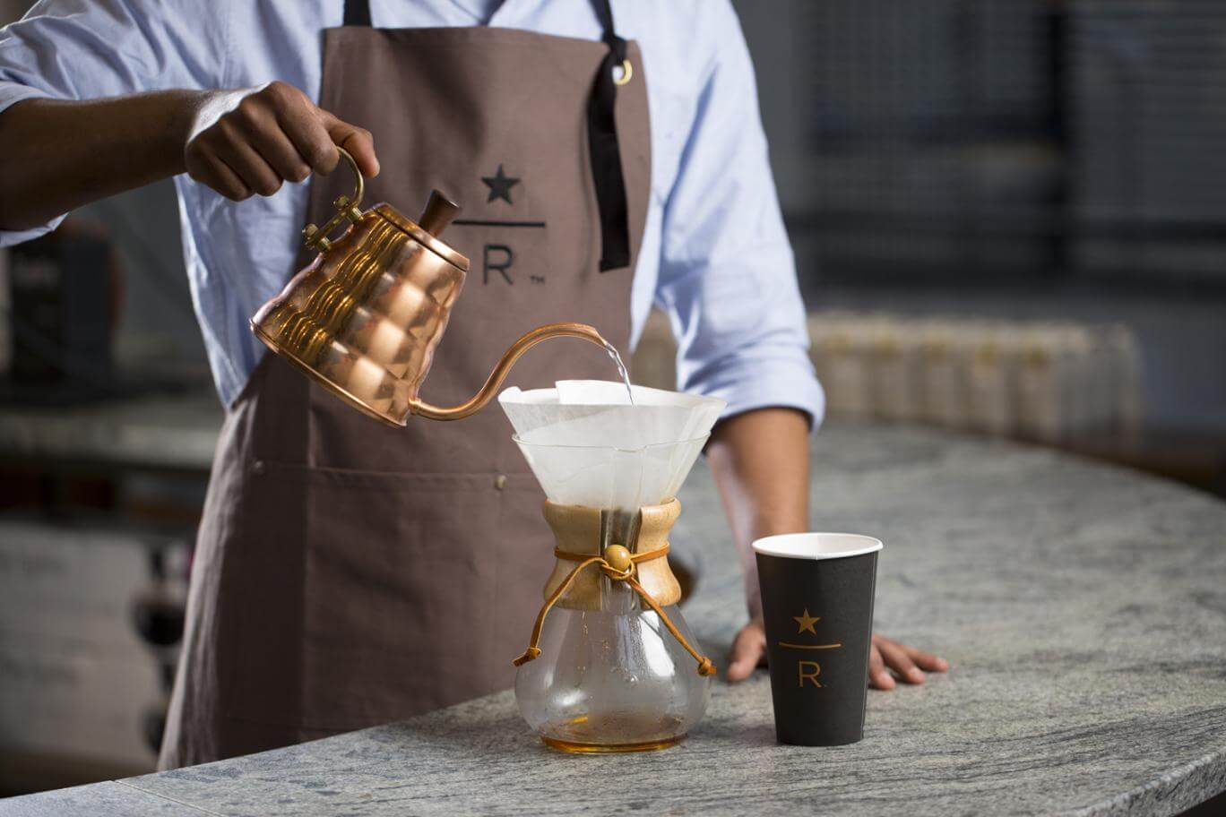
Starbucks Reserve coffee filter and cup

Starbucks have harvested everything related to coffee provenance and everything trending in Shoreditch, jammed it into a cramped and chaotic space, and called it ‘Star Reserve’.

Hip logo; check. Menu on a clipboard; check. Coffee prepared using mad science…check. Wines and spirits on display….errr….this is a Starbucks concept, right?

I understand the growth in casual dining traffic last year topped 11.6%[1] and that QSR Coffee concepts also did extremely well, however merging the two might not be what works. Or is it?

The 2014 EY insights report states that customers are looking for value and quality, and that needs to be represented in a differentiated customer experience. So I can see the rationale behind combining an experience from morning through to evening that delivers quality and value, but the brand message still wasn’t clear to me. And it looked like there was a little bit of “finger-crossing” going on behind the scenes.

Pret-a-Manger launched their #GoodEvenings offer on the Strand earlier this year. AND, as you would expect from the QSR service experts, you intuitively know what you’re getting. But that’s their brand character, isn’t it?

So I’m reserving judgement on the ‘Star Reserve’ concept. Can they make the leap to clarity and longevity, while simply getting it right?

The good news is that the client we met with is launching a bakery and coffee concept that will reinvent the morning-through-evening category. So seeing how Starbucks is trying to shake things up was a great way for them to see how important the right design-thinking is crucial. For now I think OUR brand development thinking is definitely much more focused on what works, rather than just hoping it’s on-trend.

But with a record number of new casual dining concepts opening up this Autumn, let me know which ones confuse, delight or wow you…

[1] NDP Group Analysis, published as part of EY Restaurant & Casual Dining Insight Report, Sept 2014.

Moving straight from lunch to casual dining…

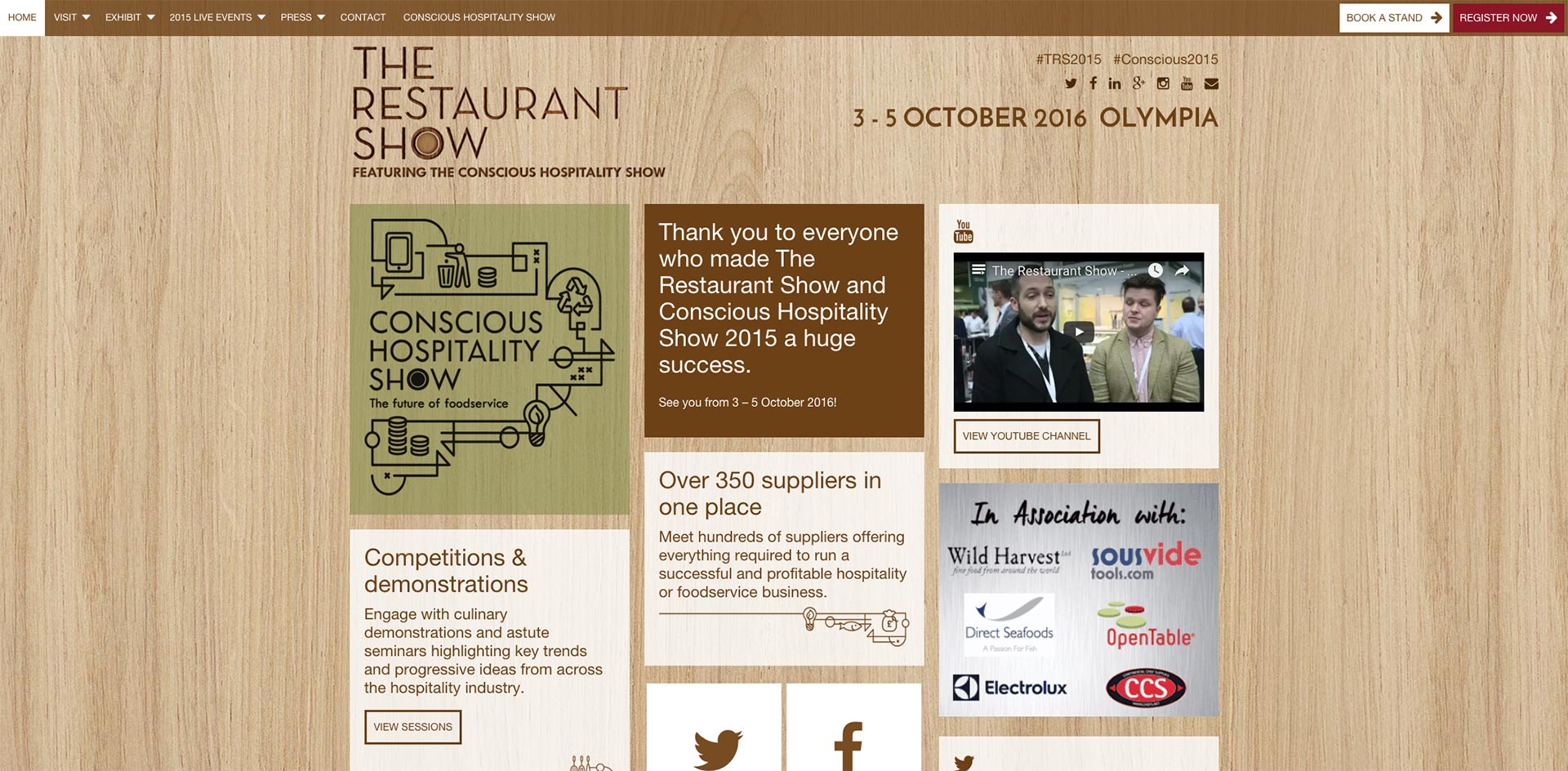
The Restaurant Show 2015

Besides the free crisps, and even a bottled ‘hangover cure’, we were able to meet with a couple of clients and prospects about making their design work for their brands in this increasingly important market.

(I have to say the hangover cure didn’t work. I tried it over the weekend and I can’t say I’d recommend it. Sorry.)

But feedback about the brands we saw at the exhibition from the team was varied:

“Over complicated.”

“A great energy about the sector.”

“White noise was all I heard. There is a huge opportunity for a different brand to cut-through the dull sandwich that is ‘lunch’.“

So is ‘lunch’ a simple concept that has become an overcomplicated and saturated market? Or is brand differentiation lost in generic design?

I have a feeling it’s the latter.

So now’s the time for some brave new concepts in the food-to-go market and next week we’ll be at The Restaurant Show at London Olympia, seeing what the mood is like across casual dining sector.

We’ll be meeting our long-time friends Grapes Design – who specialize in interior design – and we’ll be meeting a few good friends to discuss how we can make brands work across marketing planning, menus, POS, and even helping them pitch their concepts to Landlords for that elusive optimal space.

But mostly we’ll be watching to see if we can’t find that concept that we believe can really make a difference to the casual dining sector, at any time of day.

We love working with the brave, so let me know if you’re around for a coffee…..or any other casual dining or food-to-go concept indulgence you’d like.

The dawn of brand confidence.

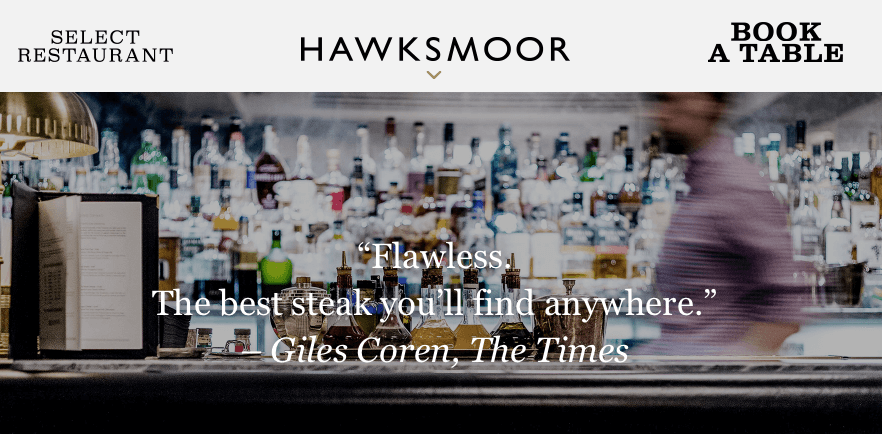
Hawksmoor website

But what next?

We at Dunk Design think we’re starting to see brand confidence pervading brand provenance in the restaurant sector.

We went to Hawksmoor in Knightsbridge this week and the simplicity and clarity in their menu design, and understated provenance, gave the impression that this brand really knows what it is doing.

Less is always more in my eyes. It’s a steak house, with superior seafood options and cracking cocktails.

Research undertaken back in 2012 by foodservice analysts Horizon showed that, although people are exposed to more exotic tastes via the media and wanted to see innovation from their casual dining experience, the top 10 most commonly listed dishes remained largely unchanged. People still want steaks, burgers, pizzas and fish and chips from their casual dining.

So as economic and consumption trends tell us that ‘experience’ will become the tradeable commodity of the future, what does this mean for the casual dining sector?

How will design change – specifically menu design?

Yes, consumers have wanted innovation in the past but we think their behaviours then and now suggest otherwise, and 2016 will see a shift back to the confidence of your choice in ‘experience’ … rather than a noisy menu with vintage brand elements assaulting your senses.

All the tricks of the trade, including menu layout, anchors, pricing and overall language surrounding food provenance will be replaced by a simplicity that allows the brand to be truly who it wants to be.

Hawksmoor is already there. This is a brand that isn’t trying too hard to be everything to everyone. It has a clear menu, with a clear and superior experience.

Although the casual dining sector, including managed pubs, has seen growth over the past 12 months we think consolidation of concepts is on the horizon.

So what role will your brand play? And how can you inject more confidence into your brand provenance?

Take a look at Hawksmoor, or better yet, visit. It will be worth your while.

Dunk Design white crest

The Windsor House

Boutique meeting and sitting rooms

A unique, fully air-conditioned, self-contained eight person meeting space right in the heart of Windsor.

Enter your details below, and we'll get back to you with further information and availability.

We will only use the information above for contacting you regarding the hiring of The Windsor House. Privacy Policy
This website uses cookies to ensure you get the best experience on our website.