Triggered by the new Steve Jobs film, the context was a discussion around brands that have very simple yet powerful logos like Apple, Nike and Twitter. All these identities enjoy a position where their brand recall is so powerful that their name is no longer required in their logo. Genius.
For me, less is always more and simple is always best. Yet it’s never THAT simple.
The evolution, design and effort required to reach a point where the name isn’t required is often underestimated. So as we see more and more start-ups, entrepreneurs and evolving businesses throwing new communications our way, how hard is it to ensure a logo will evolve to a point where it perfectly embodies a brand AND has mass recall?
The marketeers I speak to understand that this is something that takes work. However, they must also have a long-term vision when beginning the logo development journey.
When you’re briefing a logo, the three key ingredients you must always look for in the delivery are:
- Aesthetic: it has to look good – and it has to be unique!
- Relevance: to your product or brand, and
- Simplicity: the graphic has to work efficiently and be versatile.
I’d like to think that Nike’s overall message was movement and positivity. The tick leaves you with that feeling, in a very efficient design that has become synonymous with sport over the decades.
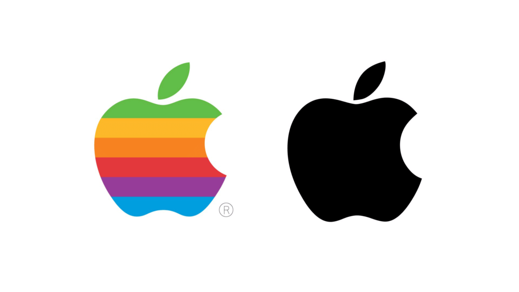
And Apple, although inspired by Sir Isaac Newton’s gravity ‘incident’, now wants to let you know they are all about life and taking a bite from it (from all the theories, that’s my interpretation). But it’s the uniqueness of that bite that gives the graphic scale, always ensuring it’s seen as an apple and not a cherry.
And Twitter is about sharing short insights with flight, as the birds do for me every morning with simplicity and efficiency.
All three of these brands’ logos started somewhere else, in a more complex, fussy place. Remember Apple’s early logo, a rainbow of colours in an apple and the word ‘Apple’ underneath? Look at it now.
So, what have we learnt from these three brands? Get it right, keep it simple – and evolve your logo until it’s reduced to its bare bones. And then someone will make a film about you. Simple!