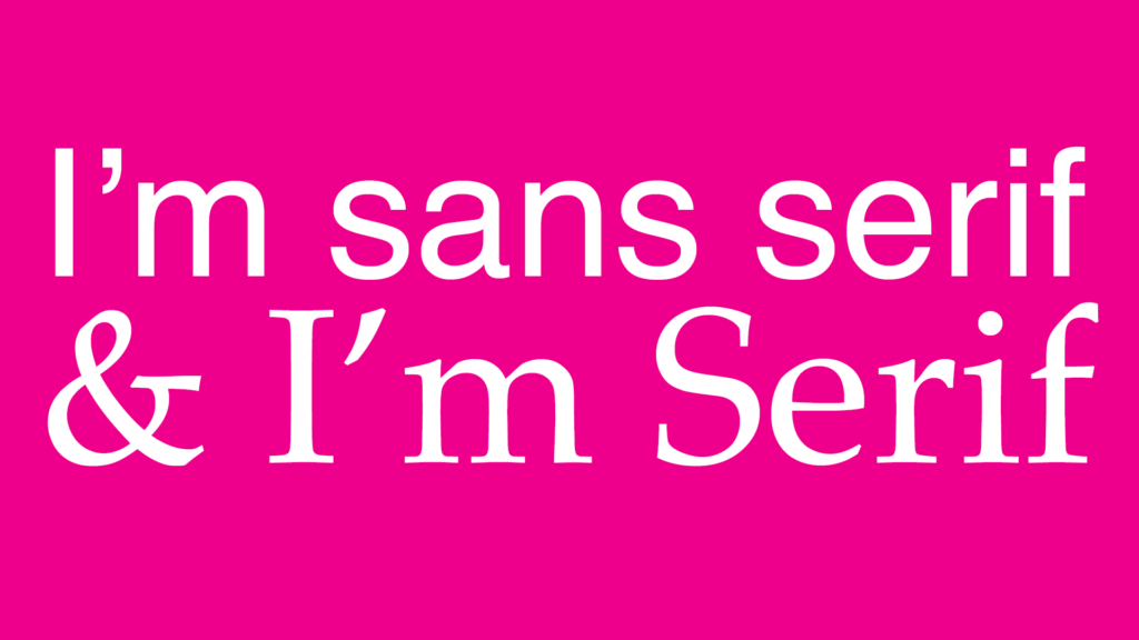
We’ve all suffered from feedback that an email is too long or too hard to read – could changing the font make it more palatable and your messages more memorable?
Rebecca Greenfield wrote an interesting piece on this for Bloomberg Business last year. She spoke to a number of great font designers, the likes of Bruno Maag, Gerry Leonidas and Jose Scaglione, who designed Literata, the Google Play books font. It’s worth a read but they all agreed the future may see us all using a new email font to at least help get some of those dull, but extremely important, messages read.
We love a bit of Helvetica ourselves, but we know that its’ lack of consistent spacing makes it harder to read in large amounts and so we never recommend using it in long emails or reports.
Our advice is, when you have a long or important message to convey by email, try changing the fonts and see if it has an impact. Test messages with friendly colleagues and friends to get their feedback – try both serif and sans-serif fonts and see if it affects the impact of your message. But please steer well clear of Comic Sans!


