I’m not going to comment on the plagiarism row, however all this talk of Olympics logos has made me revisit one of the most inspiring pieces of work I think the Olympic movement has delivered to us in modern times.
OK, I’m not a keen sportsman, but when it comes to design I was blown away by the London 2012 logo when it was released. And I continue to be so today.
It was the first time the Olympics had engaged in a time-based piece of design, rather than the traditional approach that had been the safe-haven up until 2012.
It was brilliant; urban, exciting and bursting with energy. We hadn’t seen anything like it before. The typography was edgy, challenging and, well….a bit weird. Someone had taken the Manual of Semiotics out and got it crazy ‘high’ (not that we endorse that).
But the problem was, when it was revealed to the world in 2007, that instead of broad acceptance the world went into spasms and gasps of LOLs and WTFs. It was aghast and confused that it hadn’t followed convention.
Wolff Olins, the logo’s designers, had recognized the noughties’ burgeoning of blurred media that was taking over our lives. Consumers were now absorbing vast quantities of information and data on the move without recognising the boundaries between static graphic design and time-based media such as film, sound and animation – and the London 2012 logo was designed to move, throb and radiate animated energy.
Blurred media, of which this logo was a brilliant example, was becoming the norm but consumers simply weren’t ready for it – and therein lies the paradox. And these iconoclasts were further exacerbated by the withdrawal of the pivotal animation after complaints from people concerned that it could prompt seizures, leaving the static logo orphaned. The medium was absolutely the message but that medium had just had it’s engine ripped out.
Ije Nwokorie talked about the logo representing London as ‘an international, multicultural, creative, modern, energetic and therefore dissonant city’[1]. Energy was at the heart of the design and it also represented the movement of innovation in British culture, and of the legacy of London 2012 itself – which was people making things happen for themselves and for their communities.
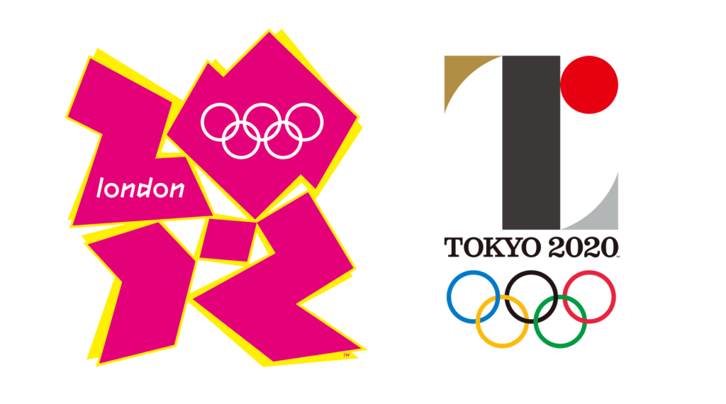
In comparison to the Rio 2016 and Tokyo 2020 logos, the London 2012 logo looked like a gang of hyperactive parkour kids had run riot with spray paint, sugar and gaffer tape. I’m not saying the Rio 2016 logo doesn’t have a sense of fluidity, or that Tokyo 2020’s design isn’t using a smart typographical solution, they just don’t have the energy, innovation and sense of ‘absolute now’ that the London 2012 logo brought to the games.
The massive burst of energy in this design gave us only a hint of what was to be one of the most successful games of the century so far. OK, a design almost too clever for most, but I think people will start to look back now and realise what magic surrounded the 2012 logo.