Will we ever see another ground-breaking logo like 2012?

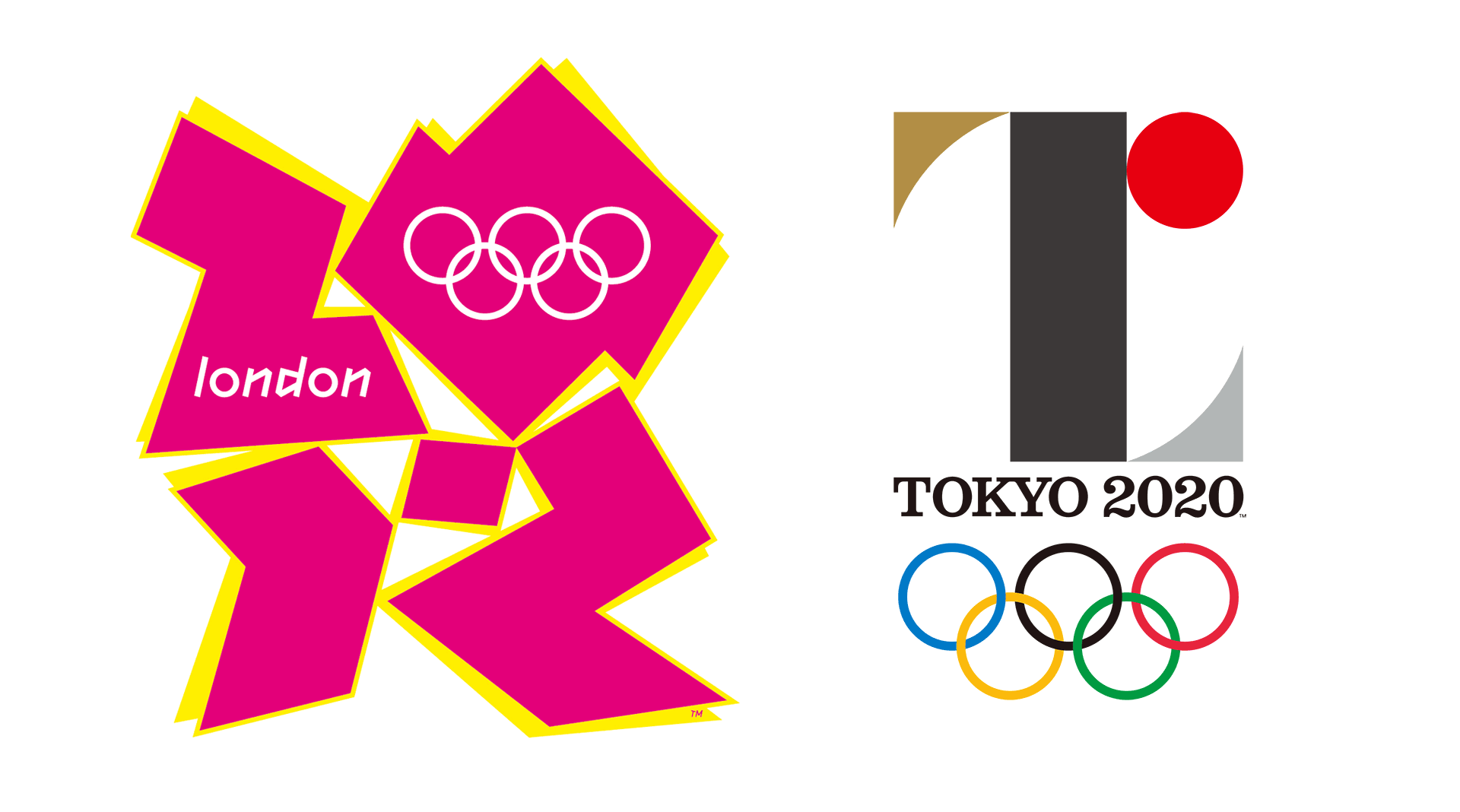
London 2012 vs Tokyo 2020

I’m not going to comment on the plagiarism row, however all this talk of Olympics logos has made me revisit one of the most inspiring pieces of work I think the Olympic movement has delivered to us in modern times.

OK, I’m not a keen sportsman, but when it comes to design I was blown away by the London 2012 logo when it was released. And I continue to be so today.

It was the first time the Olympics had engaged in a time-based piece of design, rather than the traditional approach that had been the safe-haven up until 2012.

It was brilliant; urban, exciting and bursting with energy. We hadn’t seen anything like it before. The typography was edgy, challenging and, well….a bit weird. Someone had taken the Manual of Semiotics out and got it crazy ‘high’ (not that we endorse that).

But the problem was, when it was revealed to the world in 2007, that instead of broad acceptance the world went into spasms and gasps of LOLs and WTFs. It was aghast and confused that it hadn’t followed convention.

Wolff Olins, the logo’s designers, had recognized the noughties’ burgeoning of blurred media that was taking over our lives. Consumers were now absorbing vast quantities of information and data on the move without recognising the boundaries between static graphic design and time-based media such as film, sound and animation – and the London 2012 logo was designed to move, throb and radiate animated energy.

Blurred media, of which this logo was a brilliant example, was becoming the norm but consumers simply weren’t ready for it – and therein lies the paradox. And these iconoclasts were further exacerbated by the withdrawal of the pivotal animation after complaints from people concerned that it could prompt seizures, leaving the static logo orphaned. The medium was absolutely the message but that medium had just had it’s engine ripped out.

Ije Nwokorie talked about the logo representing London as ‘an international, multicultural, creative, modern, energetic and therefore dissonant city’[1]. Energy was at the heart of the design and it also represented the movement of innovation in British culture, and of the legacy of London 2012 itself – which was people making things happen for themselves and for their communities.

In comparison to the Rio 2016 and Tokyo 2020 logos, the London 2012 logo looked like a gang of hyperactive parkour kids had run riot with spray paint, sugar and gaffer tape. I’m not saying the Rio 2016 logo doesn’t have a sense of fluidity, or that Tokyo 2020’s design isn’t using a smart typographical solution, they just don’t have the energy, innovation and sense of ‘absolute now’ that the London 2012 logo brought to the games.

The massive burst of energy in this design gave us only a hint of what was to be one of the most successful games of the century so far. OK, a design almost too clever for most, but I think people will start to look back now and realise what magic surrounded the 2012 logo.
[1] Co. Design Interview, Jordan Kushins 2012

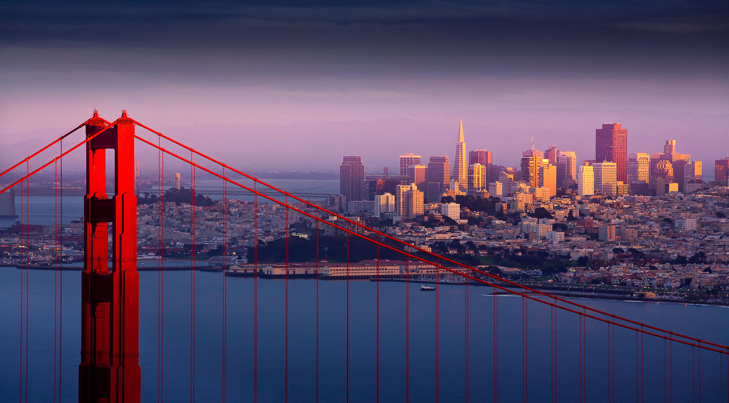
San Francisco – synonymous with innovation.

San Francisco Bay – Golden Gate Bridge

Now, one of the world’s leading innovative brands has tipped its hat to the city that continues to bring us innovation for ‘life’, by introducing the San Francisco typeface.

I, like many other users, may be struggling with Apple’s constant fiddling about with iTunes (and don’t even start me on iCloud) but this is one design evolution which recalls the exciting early Jonny iVe days. (see what I did there?) As usual, there’s nothing new here. It’s just wearing a fresh pair of hugely sexy pants.

I doubt Apple actually ‘designed’ San Francisco. I suspect that they hermetically sealed Helvetica (undoubtedly ‘the stud’ in this environment as I’m certain all designers will agree) and DINPro in an erotically-charged typo-vault until lots of little San Franciso characters spilled out into an incubator.

But, however they did it, I’m still impressed with how Apple has looked at the pragmatic application of a typeface with the user as its’ focus. As the first font released by Apple in almost 20 years, their motivations mean things are definitely changing.

OK, we all know about Steve Jobs’ passion for design and user experience – but did you also know that he was bat-ass crazy for proportionally-spaced fonts? (hubba hubba)

So would he be proud of San Francisco?

Would he be happy with it’s ability to work across different device and platforms, delivering another inevitable improvement in user experience?

The sad thing is we can only guess at Jobs’ reaction. What I really want to know is if anyone has noticed?

Longer fonts and some changes to proportional representation (and kerning ratios, but let’s not digress) have been largely driven by the Apple Watch screen. And, although the numbers on their sales released this week haven’t been as impressive as we’re used to from Apple, the fact remains that wearables will change everything eventually.

So have you noticed?

And if you want to see the sights of San Francisco, including some of it’s greatest innovative stories, come the Autumn all you’ll have to do is look at your phone.

Millennial cynicism, or not?

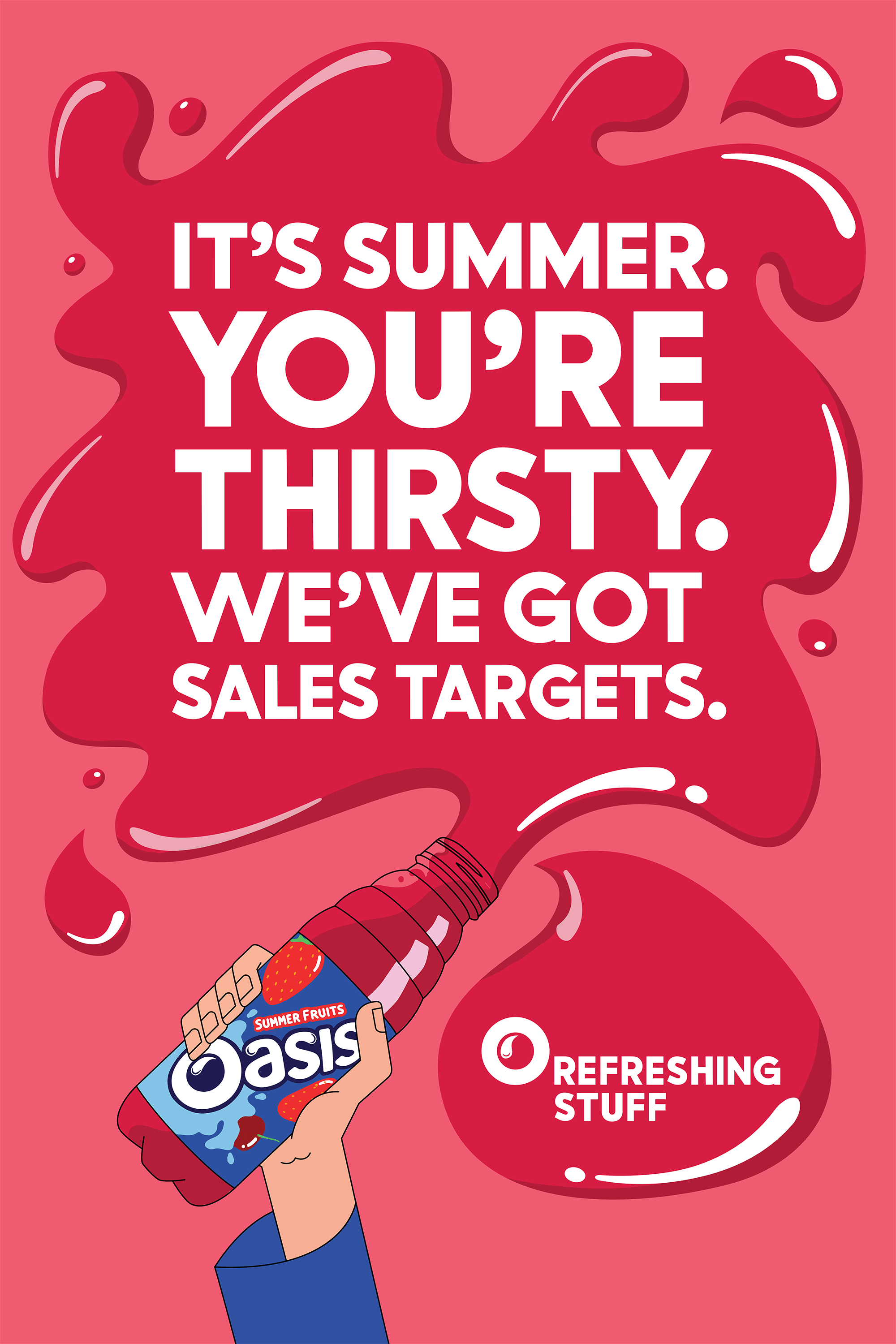
O Refreshing Stuff – campaign poster by Oasis

I first saw it when caught in traffic. I noticed the poster on a bus shelter and it made me smile – the directness just appealed to me.

Then, during a client meeting, the simplicity of the Oasis drinks campaign came up and we all agreed that it was an interesting creative direction to take, but we couldn’t decide who it was aimed at.

And, this morning, a connection liked a photo of the campaign on LinkedIn.

Having now found out a bit more about it, it was apparently designed to target teenagers. None of the people talking about it, including myself, are teenagers or Millennials.

I’ve been assured this is the perfect mix of cynicism and pragmatism for the millennial generation, but is the message just too mature?

“You’re thirsty. We’ve got sales targets.”

The campaign created by The Corner agency is a brilliant eye catching piece of honesty, but does it say to Millennials that Oasis can be trusted or is it just appealing to their pragmatic attitude?

The Brookings Institution, one of America’s oldest and wisest Think Tanks, says that Millennials are the least trusting generation on record. Yes, they love their social impact motivations but they also believe that people can’t be trusted. They say this combination of social impact and mistrust shows itself in a truly pragmatic approach to life. I get that.

So how does the new Oasis campaign reach that generation?

I decided to call three Millennials that I know, including a teenager (although, I had to IM one of them because he’s too busy being an entrepreneur at the age of 22).

The responses were as follows:

“Sorry, I don’t get that.”

“Sounds to me like someone couldn’t be bothered or just doesn’t care.”

“Umm, I’m not sure I know what that means.”

Although the message was pragmatic, is the message just too mature? Can cynicism be used as currency, or is the Oasis message cynicism for another generation?

We loved it! We’ve even bought some Oasis drinks because we thought it was so clever. But is that the result Oasis was looking for?

Good old brand basics or brand confusion?

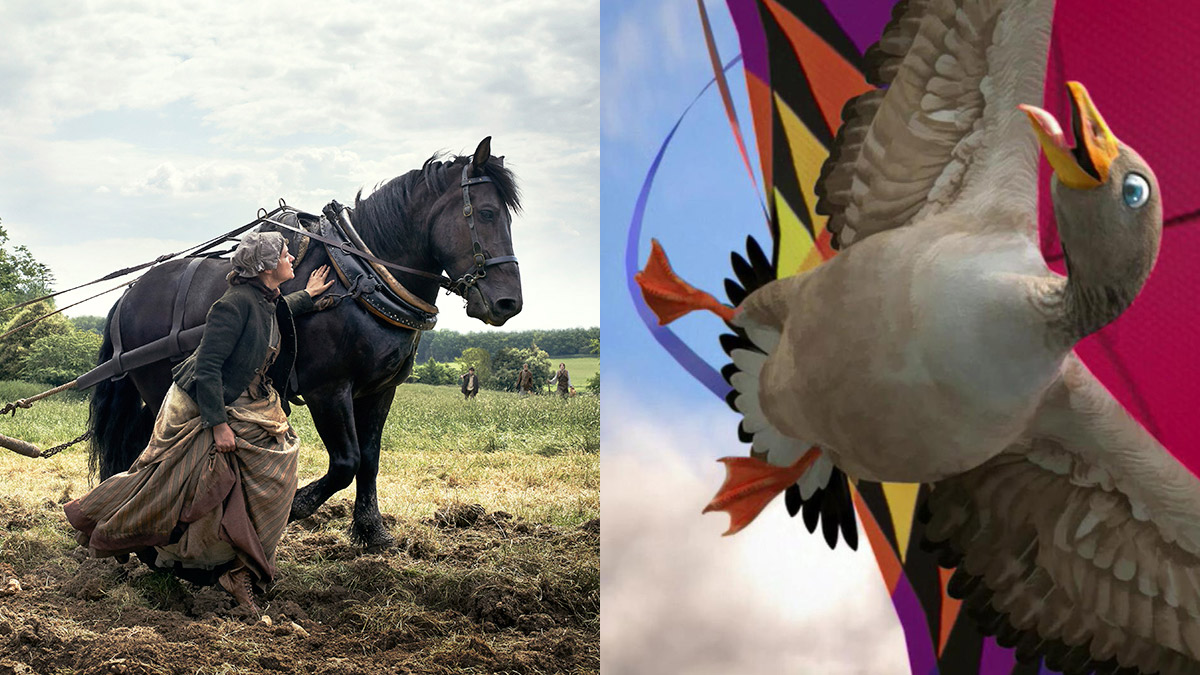
Lloyds Bank TV advert

Then we thought it must be the new John Lewis ad, however soon realised we were nowhere near Xmas. So it must be for an insurance company, as we were being bombarded with feelings of trust.

In that last instant we also realised the consistent thread was the black horse, so we searched our memory banks for the brands that have a black horse and that might have been around for a long time. Could it be Lloyds Bank?

All these thoughts occurred within a period of 10-20 seconds of the beginning of us noticing the ad. Some of the creative brains we spoke to found it annoying, while some admired its pure focus on getting back to core brand values.

With the departure of TSB from the brand family last year, and the hugely successful animated campaign that began back in 2007 “for the journey” going with it, was this a way to re-establish the bank’s core values with customers? Or was it trying to differentiate the story of the split?

TSB have moved on and evolved their animated approach, so little confusion for their loyal customers.

But where does this ad fit in the overall landscape of creative output we see in digital, mobile and on our TV screens? Will this differentiate Lloyds for their market?

Who is it aimed at? It’s an excellent example of working with the core values a brand aspires to hold, and the key visual cues that lead us to a point of recognition kind of work, but how will it resonate across Lloyds Bank’s diverse customer group?

We’ve loved and enjoyed the Freederm Ad from Autumn 2014. The flying goose was clearly aimed at the freedom loving millennials generation and their desire to live freely and with no constraints. It’s the perfect example of a piece of creative brain juice that appeals directly to those it was created for, leaving some of us in complete bewilderment as to what it was about 😉

So how will the black horse now celebrate 250 years with millennials, Gen Y and even the silent generation? We can’t wait to see how the 250th anniversary celebrations will extend beyond 2015 and begin to build a brand relationship with all the many different Lloyds customers.

So hats off to the creative brains at Adam & Eve/DDB involved and we wait in anticipation for where this will go next, across the fragmented media world we live in.

Dunk Design white crest

The Windsor House

Boutique meeting and sitting rooms

A unique, fully air-conditioned, self-contained eight person meeting space right in the heart of Windsor.

Enter your details below, and we'll get back to you with further information and availability.

We will only use the information above for contacting you regarding the hiring of The Windsor House. Privacy Policy
This website uses cookies to ensure you get the best experience on our website.